TidyTuesday - Bring Your Own Data Week!
By Yanina Bellini Saibene
January 7, 2023
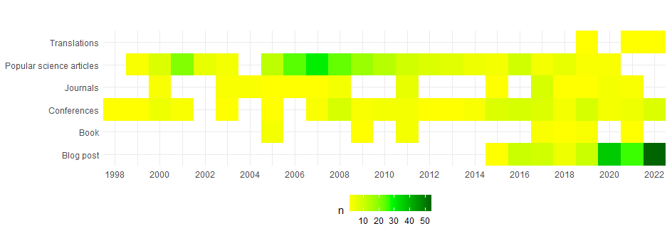
24 year of publication by type
Picture of Isaac Smith at Unsplash
Last month I resigned from my position at INTA and did a review of some of the things I did in the 24+ years as a researcher. As this is the Bring Your Own Data Week for TidyTuesday I decide to write a blog post explaining how to make a heat map with all the publications of which I have a record during those 24+ years (and at academic work we keep track of everything, so I have a lot of publications to play with).
The data
I have a csv file with five columns:
-
Title: have the title of the publication. For some of them also have the author, where was published and the date.
-
Year: the year of the publication.
-
Type_Long: a description of the type of publication, has data in Spanglish.
-
Type: a short description in English of the type of publication.
-
Link: the publication url if it is available online (all the blog post on this website don’t have the url on the dataset)
Reading and wrangling the information
The goal is to create a plot with the number of each type of publication by each year, starting in 1998 and finishing in 2022.
The first step is to read the csv file and group some categories usign mutate. I will not differentiate between national and international conferences and I will not differentiate between books and book chapters.
With the new categories ready I made the calculation of the quantity of each type of publication by year using the function count
library(tidyverse)

PublicacionesPorAnioYanina <- read_csv("datos/PublicacionesPorAnioYanina.csv")

pub_xtipoxanio <- PublicacionesPorAnioYanina %>%
  mutate(Type = case_when(
    Type == "National Conferences" ~ "Conferences",
    Type == "International Conferences" ~ "Conferences",
    Type == "Book Chapters" ~ "Book",
    TRUE ~ Type
  )) %>%
  count(Year, Type)
Ploting
With the data in the format I need, I create the plot, firts the base of the plot
p <- ggplot(pub_xtipoxanio, aes(x = Year, y = Type, fill = n ))
Now, using geom_tile() we plot the heatmap
p + geom_tile() +
  theme_minimal() +
  scale_x_continuous(breaks = seq(1998, 2022, by = 2), expand = c(0, 0)) +
  scale_y_discrete(expand = c(0, 0)) +
  scale_fill_gradientn(colours = c("yellow", "green", "darkgreen")) +
  coord_equal() +
  theme(axis.title.y = element_blank(),
        axis.title.x = element_blank(),
        legend.position = 'bottom')
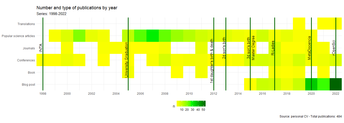
Finally I use geom_vline and annotate to add some important events in my life during this 24 years of working at INTA. I also use labs to add other anotation likes title, subtitle and data source.
p + geom_tile() +
  theme_minimal() +
  scale_x_continuous(breaks = seq(1998, 2022, by = 2), expand = c(0, 0)) +
  scale_y_discrete(expand = c(0, 0)) +
  scale_fill_gradientn(colours = c("yellow", "green", "darkgreen")) +
  coord_equal() +
  theme(axis.title.y = element_blank(),
        axis.title.x = element_blank(),
        legend.position = 'bottom') +
  geom_vline(xintercept = 1998, color = 'darkgreen', size = 1.2) +
  annotate("text", x=1997.8, y=4, label="INTA", angle=90) +
  geom_vline(xintercept = 2005, color = 'darkgreen', size = 1.2) +
  annotate("text", x=2004.8, y=3, label="University Graduation", angle=90) +
  geom_vline(xintercept = 2012, color = 'darkgreen', size = 1.2) +
  annotate("text", x=2011.8, y=2.9, label="1st daughter's birth & death", angle=90) +
  geom_vline(xintercept = 2013, color = 'darkgreen', size = 1.2) +
  annotate("text", x=2012.8, y=4, label="2d son's birth", angle=90) +
  geom_vline(xintercept = 2015, color = 'darkgreen', size = 1.2) +
  annotate("text", x=2014.8, y=4, label="3d son's birth", angle=90) +
  annotate("text", x=2015.2, y=4, label="Master Degree", angle=90) +
  geom_vline(xintercept = 2017, color = 'darkgreen', size = 1.2) +
  annotate("text", x=2016.8, y=4, label="R-Ladies", angle=90) +
  geom_vline(xintercept = 2020, color = 'darkgreen', size = 1.2) +
  annotate("text", x=2019.8, y=4, label="MetaDocencia", angle=90) +
  geom_vline(xintercept = 2022, color = 'darkgreen', size = 1.2) +
  annotate("text", x=2021.8, y=4, label="rOpenSci", angle=90) +
  labs(title = "Number and type of publications by year",
       subtitle = "Series: 1998-2022",
       caption = paste0("Source: personal CV - Total publications: ", nrow(PublicacionesPorAnioYanina)))
- Posted on:
- January 7, 2023
- Length:
- 3 minute read, 628 words
- Tags:
- Community English Visualization rstats